The Strategic Context: A New Vision for Customer Service
The Customer Service Desk at any Tesco is a hub of constant activity. It's a high-pressure environment where speed and ease-of-use are critical. I was asked to help define the exchanges journey for our new roll-out of Tesco Tills across the our 3000+ UK stores.
"Our vision is to establish a cutting-edge till software platform that empowers every customer and colleague, fostering a seamless and convenient checkout experience at Tesco"
The Legacy Journey: A Look at the Old System
Before this project, colleagues used software on an NCR-provided till. The interface and user flow for anything beyond a simple purchase were unintuitive and fragmented. For an exchange, the colleague had to perform two completely separate transactions, creating a slow and confusing experience.
Lack of a Dedicated "Exchange" Workflow
The colleague has to use a combination of functions—selecting the item, choosing a reason, checking the price, and then manually overriding it to force the system to do what they want.
High Risk of Human Error
If the colleague gets distracted or enters the wrong price during the manual override, the customer could be overcharged or undercharged. An incorrect reason code could also be selected.
Manual Price Calculation and Entry
The colleague has to first check the original price and then manually override the price of the item to honour the promotional price the customer paid. This is slow and requires the colleague to do mental calculations.
Lack of Data Integrity and Business Insight
The transaction is likely recorded as a return and a separate, heavily discounted sale. It doesn't accurately reflect that it was a "like-for-like exchange due to product quality."
The £18.8M Problem: A Step Backwards
With the rollout of the new Tesco Till software, a critical piece of functionality was lost: the ability to process a product exchange in a single transaction. This meant the new system, intended as an upgrade, was actually a functional regression from the legacy NCR system.
What seemed like a small feature gap created a massive £18.8M annual negative impact on the business, broken down into four key areas:
Operational Inefficiency (£806k cost)
A clunky 8-step workaround added 30 seconds to every exchange, creating 67,000 hours of extra colleague workload annually.
Poor Customer Experience
Longer queues frustrated customers. Card refunds took 3-5 days, creating a "paid twice" feeling when customers had to pay again for the new item.
Revenue Loss & Policy Failure (£9M risk)
An "exchange-only" returns policy for transactions without a receipt became unenforceable without a dedicated exchange function, putting millions in potential revenue at risk.
Increased Fraud Opportunity (£9M risk)
The flawed two-step process created a major fraud loophole, allowing fraudsters to get a refund for a stolen item and leave without making the exchange purchase.
Our Process: From Understanding to Solution
1. Discovery & Empathy
To ground our work in reality, we spent time in several Tesco stores observing colleagues and synthesising existing research. This helped us move beyond assumptions and define the real needs of our users.
As a colleague, I want to be able to process a return on the system without having to manually work out what the customer requires as a refund or what we need to take back in rewards.
As a customer, I want to be able to exchange items and be sure that the transaction with money and rewards is accurate.
As a colleague, I want to be able to process a mixed basket on the system to enhance the customer's experience.
As a customer, I want to return and purchase items in the same journey.
As a colleague, I want to be able to override a refund amount the system is giving me if I think it is not the right thing for the customer.
As a customer, I want a return and exchange journey that is personalised to me.
2. Mapping the Opportunity: Understanding Core Scenarios
Through workshops with stakeholders, we identified numerous return and exchange scenarios. The business logic was complex, varying by product type, reason for return, and original purchase conditions. Documenting these helped define the project's scope.
| Product Category | Scenario | Key Condition | Business rule & system action |
|---|---|---|---|
| Home (Electronics) | Customer wants to exchange a £300 TV for a different, more expensive £400 model. | Within 30 days (Change of Mind): The customer simply changed their mind and wants a different product. | The system must calculate the price difference. Action: Colleague accepts the old TV and charges the customer the £100 difference. |
| Fresh Food | Customer bought a yoghurt that is out of shelf life and wants to exchange it for a new one. | Within exchange window (Product Quality): The issue is a fault of the product, not the customer. | The price of the original item must be honoured. Action: The system processes a like-for-like exchange at no cost, even if the price has since increased. |
| F&F Clothing | Customer wants to exchange a £15 shirt for the same shirt in a different size. | Over 1 year (Product Quality Issue): The shirt has a clear manufacturing defect. | The original transaction is too old to find, so the system uses the current item price. Action: Colleague accepts the return and refunds the current price (£10) to the customer. |
3. Tackling the Core Challenge: The Calculation Logic
One of the biggest complexities was handling refunds for items bought on promotion (e.g., "3 for 2"). Tesco's policy is to honour the promotional price if the return is due to a product quality issue (Tesco's fault), but not if it's a simple "change of mind."
The system had to be smart enough to do this automatically. This was handled by an API team called "Quote," which takes the basket information and calculates the precise amount owed to or by the customer. My design needed to provide a simple, clear interface for the colleague that could handle these complex background calculations.


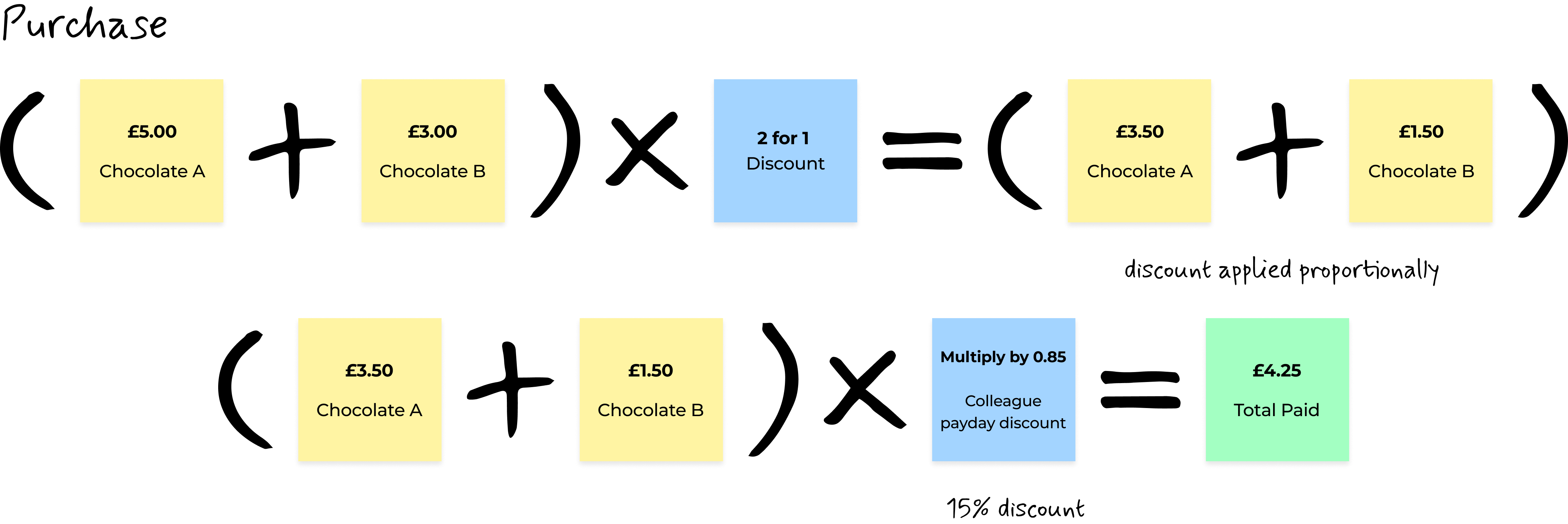
Above is an illustration of a workshop that we ran with our Calculation API team. We wanted to explore what would happen when a colleague processed a seemingly simple exchange: a chocolate bar bought on a "2-for-1" deal by a Tesco colleague, which also had a separate "15% off" payday promotion applied. The colleague wanted to bring back one item and replace it with another but after the the payday discount was no longer available.
What should the Service Desk colleague do? We found that the system didn't simply make the cheaper item free; it applied the "2-for-1" discount proportionally across both items. On top of that, it applied the separate 15% off promotion. This meant the true refund value of the returned £5 bar wasn't £5, or even the price after one discount, but a very specific £2.98.
Meanwhile, the new £7 replacement item had its own 10% non-payday discount applied, making its price £6.30. The colleague was then left stranded with these two conflicting figures and was expected to manually calculate the difference (£3.32) and enter it as a price adjustment to complete the exchange fairly.
This single example proved that the existing logic was too complex for anyone to manage manually. It became a clear mandate for our new design: the system must handle the complexity, not the user.
Ideation
How might we design a summary screen that clearly displays both returns and purchases at the same time?
This challenge focused on the final checkout view. We explored multiple ways to combine negative refund values and positive purchase prices on a single screen in an instantly understandable way.

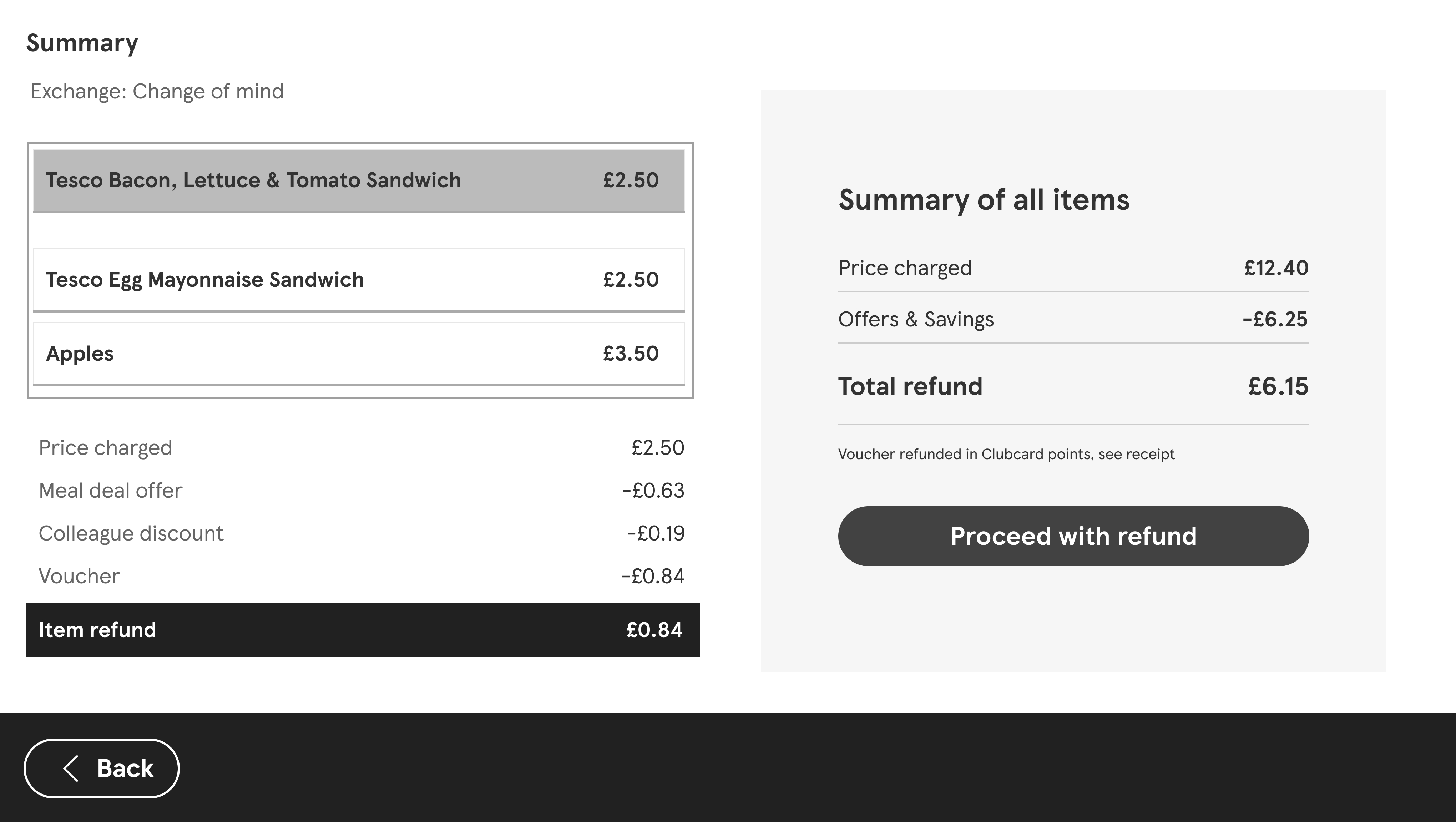
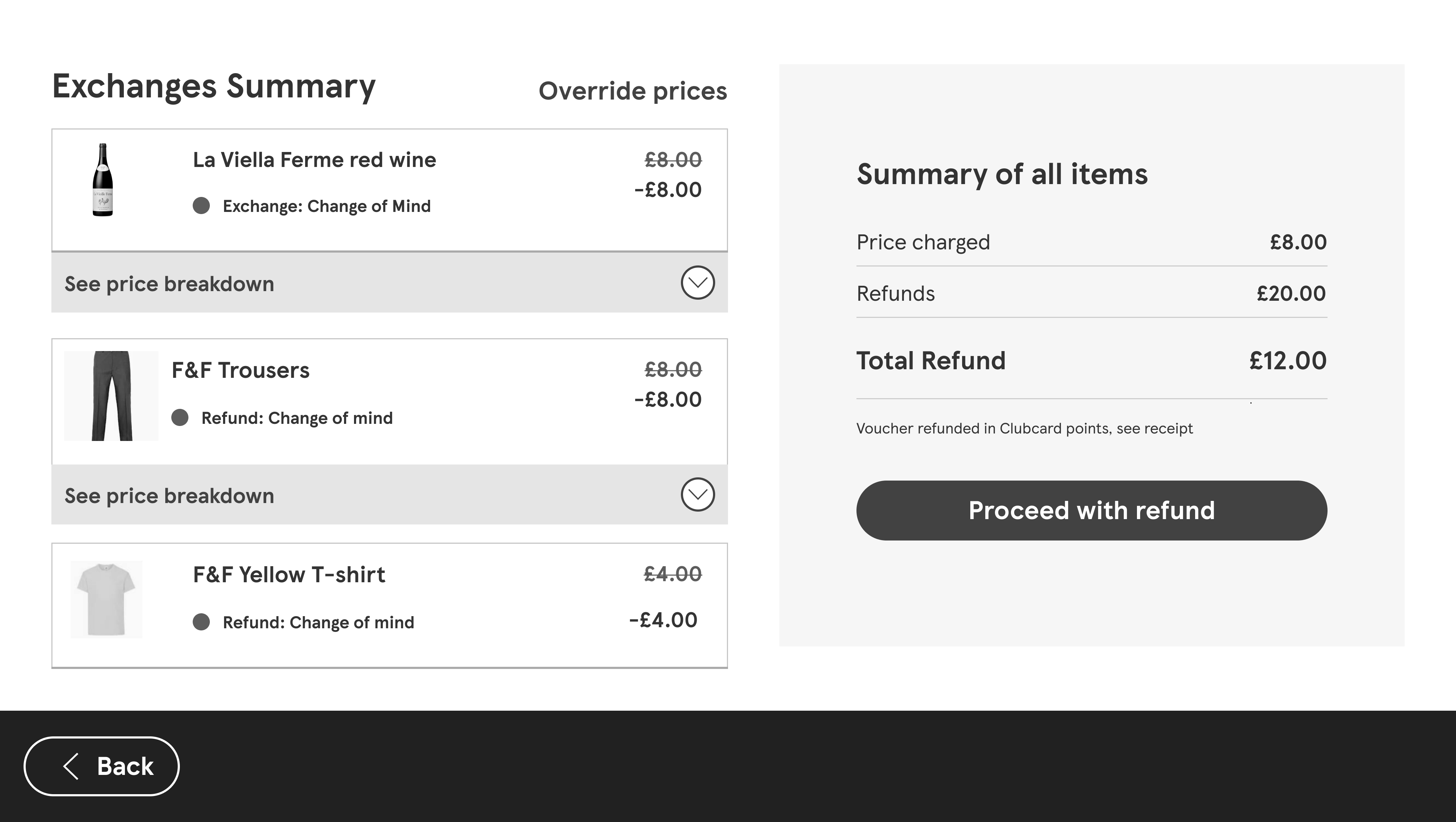
This summary page shows the returned item in grey and the new purchased items in white.

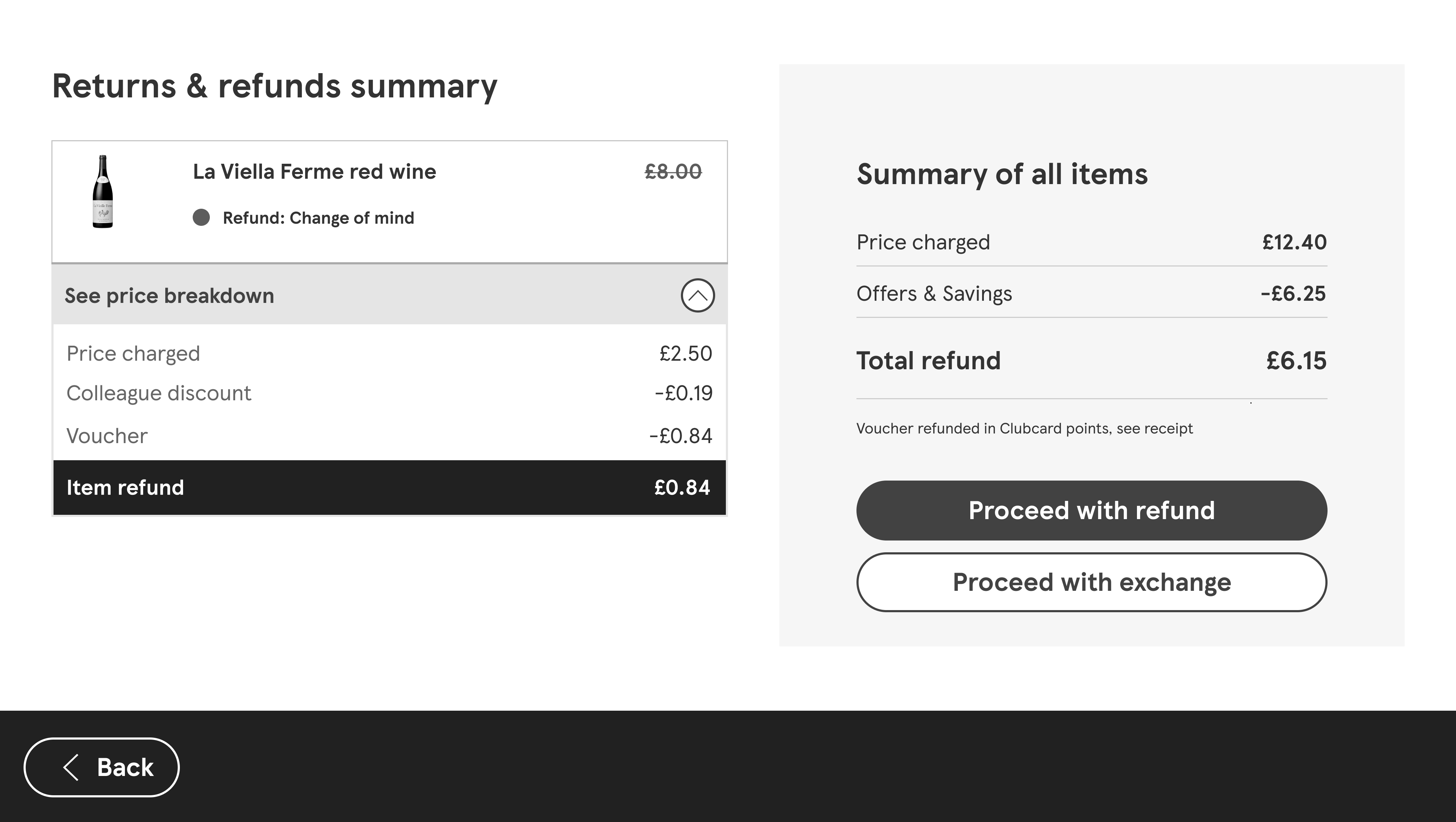
A mid-journey summary screen which allows colleagues to either proceed with the refund or enter the exchange journey.

A design which featured radio buttons which show the difference between the refund and exchange inside each product tile.
User Testing: Validating Concepts with Colleagues
To validate our early concepts and ensure our designs would hold up in a real-world, high-pressure environment, we partnered with a UX Researcher to conduct in-person usability testing sessions with colleagues at a Tesco store.
The Methodology
The Test Scenario
We created a realistic 'stress test' involving a complex promotional offer ('2-for-1' combined with a 'payday' discount) to observe how colleagues handled tricky pricing logic and edge cases with our prototype.
Key Areas of Inquiry
- Process Clarity: Did colleagues understand the new, unified flow?
- Points of Confusion: Where did they hesitate or feel uncertain?
- Emotional Response: Did the design feel manageable or stressful?
- Suggestions for Improvement: What ideas did colleagues have to make it even better?
What We Learned
A Fundamental Lack of Trust
We observed colleagues instinctively using calculators to verify the till's maths. This powerful insight revealed a deep lack of trust in the system's accuracy and showed that our new design needed to be exceptionally clear to build confidence.
Complex Promotions Caused Confusion
When testing with complex 'two-for-one' deals, colleagues were unsure how the system would handle the calculation. This confirmed our design must visually break down how promotions are applied in real-time, so the colleague doesn't have to.
Key Features Were Not Intuitive
The purpose of the 'price override' feature wasn't immediately obvious. Colleagues tried to do the maths themselves instead of using the tool, which told us the feature's labeling and on-screen guidance needed to be significantly improved.
Mental Models Didn't Match
The testing showed that the proposed workflow sometimes clashed with colleagues' established habits. This reinforced our core goal: the final design had to be overwhelmingly simple and supportive, rather than forcing users to learn a rigid new process.
Final Walkthrough
Unified Exchange Journey
The new design introduces a single, unified journey for both returns and new purchases.
Drastic Improvement in Transaction Speed
By eliminating the need to perform two separate transactions, the new unified exchange flow is significantly faster. This directly addresses the business goal of reducing queue times and improves the overall customer experience at the service desk.
Intelligent "Amend Basket" Feature
A key innovation is the 'Amend Basket' feature. This empowers colleagues to easily make price adjustments to honour promotions or resolve pricing errors in the customer's favour, without needing complex manual calculations or manager overrides.
Clear Interface & Transparent Summary
The solution moves away from the dated legacy system to a clean, modern UI. With clear typography and intuitive layouts, this new design reduces cognitive load. This is best demonstrated on the final summary screen, which provides a clear, unambiguous breakdown of the entire transaction, building trust for both the colleague and the shopper.
Results
Exchange Data Visualisation
Explore exchange transaction data with interactive charts and filters
Pure Exchanges Were the Primary Use Case
Nearly 50% of all transactions were 'Net Zero,' proving we successfully streamlined the most common scenario.
A Seamless 'Trade-Up' Experience
33-38% of transactions resulted in a purchase, showing the unified basket made it easy for customers to "trade up" and increase basket value.
Flexible 'Trade-Down' Capability
The remaining 16-20% of transactions involved a partial refund, confirming the design was robust enough to handle all three primary exchange scenarios.